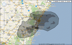
Thanks to the web site IfItWasMyHome.com, this map gives some perspective on the size of the BP Deepwater Horizon oil disaster in the Gulf Of Mexico (click to see full-size image).
I’ve centered the spill around Kiama (NSW, Australia) to show its sheer size in relation to the Illawarra region.
You can see that if the spill area were here, it’d stretch south to around Ulladulla and Braidwood, way past Canberra almost to Tumut, and north to Cessnock and Newcastle. All of the Illawarra and Sydney areas would be well and truly covered.
That’s a massive area, even with only half the spill superimposed on the land!
Current estimates put the amount of oil being discharged from the broken well at above 1,470,000 US gallons (5 564 555 litres) per day.
Up to eight rigs of the same semi-submersible type as Deepwater Horizon are exploring for oil and gas in Australian waters right now, according to the Australian Maritime Safety Authority.
If you needed evidence that we’re starting to run out of oil reserves (i.e. “peak oil”), the fact that BP found it necessary and economic to drill for oil in such a high-risk environment must surely count for something. The ocean in this area is 1.5 km deep, giving a sea-floor pressure of 150 atmospheres. And that’s just where the drilling begins – from there they’ve drilled a further 4 km down in to the ocean floor! The oil rig itself uses massive engines to ‘hover’ over the well site, a technique known as dynamic positioning. One shudders to think what would happen if the engines or the guidance system were to fail.
This level of desperation and risk-taking in our quest for more oil is a pretty good indication that something fundamental needs to change.

Comments
5 responses to “Visualising The BP Oil Disaster”
Darren,
This brings a frightening perspective to the tragedy. I will publicise at my school so the kids realise the magnitude of the disaster.
Darcy
@Darcy: It actually surprised me how large an area is affected, and it’s obviously still growing. The environmental impact is unimaginable. This is a great example of the power of mashups, drawing in data from multiple sources to create a unique and very effective communication tool.
[…] This post was mentioned on Twitter by Darcy Moore. Darcy Moore said: Visualising the BP oil disaster (from a/my local perspective) http://is.gd/d9G4A […]
I grew up between Baton Rouge and New Orleans, Louisiana. I’ve been down to the Mississippi and Louisiana coast hundreds of times as a kid to swim, fish, and explore historic sites. My heart broke into pieces as my beloved city, New Orleans, filled with water when Hurricane Katrina struck.
Now, I’m just numb. I can’t imagine all the wetlands, swamps, and coastline covered in oil. I’m having a hard time wrapping my head around the impact this spill will have. The swamps and wetlands of the Gulf Coast are as stunning and beautiful as anything else in this world. The loss is will be staggering and I hope that this event will trigger a real attempt to ween the world from the teat of oil and gas.
@Michael: That must be hard. It’s like a little piece of you has been killed. I’m hopeful that this will give us cause to reassess what we’re doing, but then the Exxon Valdez disaster was pretty big and didn’t have that effect. Time will tell.